A new website for a renown London gallery
Studio Voltaire wanted a brand new site to go with their new brand identity, that showcased their range of events and resources.
I was the lead and only designer for this project, liaising directly with the Director and the Communication manager of Studio Voltaire.
Client:
Studio Voltaire
Year
2020
The problem
Studio Voltaire wanted a new website that was flexible and showcased the range of events they put on. We were given the new brand guidelines with a strict monochrome style to follow.
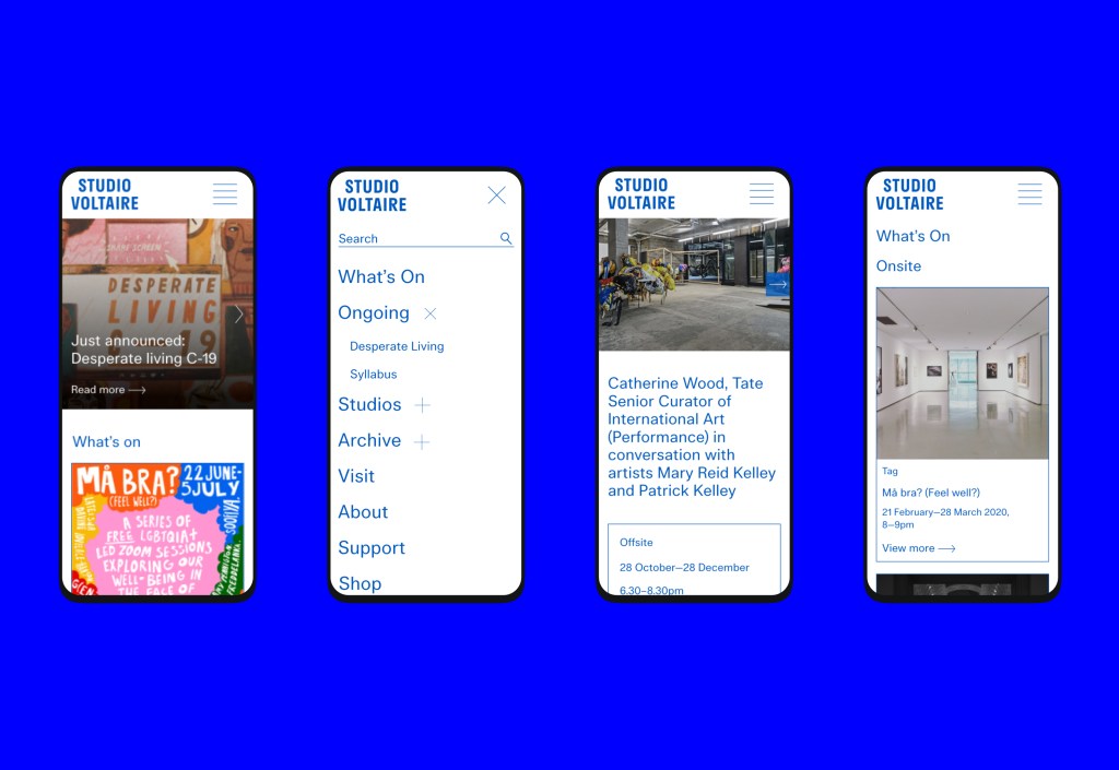
The main users are the gallery visitors who will land on the website to find out more about the current exhibitions, supported by data from Google Analytics I knew this website had to offer a great mobile experience.
The process
This project had a very small budget and the user interface was constricted to the brand guidelines which unfortunately did not follow accessibility best practices.
Design
Choosing the right look and feel
There were 2 options for the look and feel of this project. The first one was bold and made it easier for the user to navigate the website while still keeping a fresh and original design.
The second was a minimal look, but that delivered a classic and elegant feel. This was the chosen route by the client, this unfortunately meant, at times, usability best practices weren’t taken into consideration.
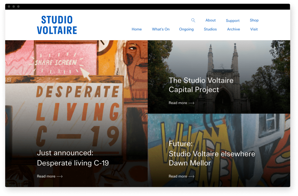
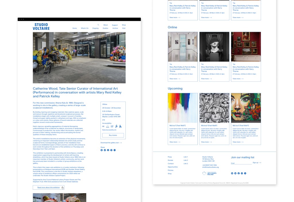
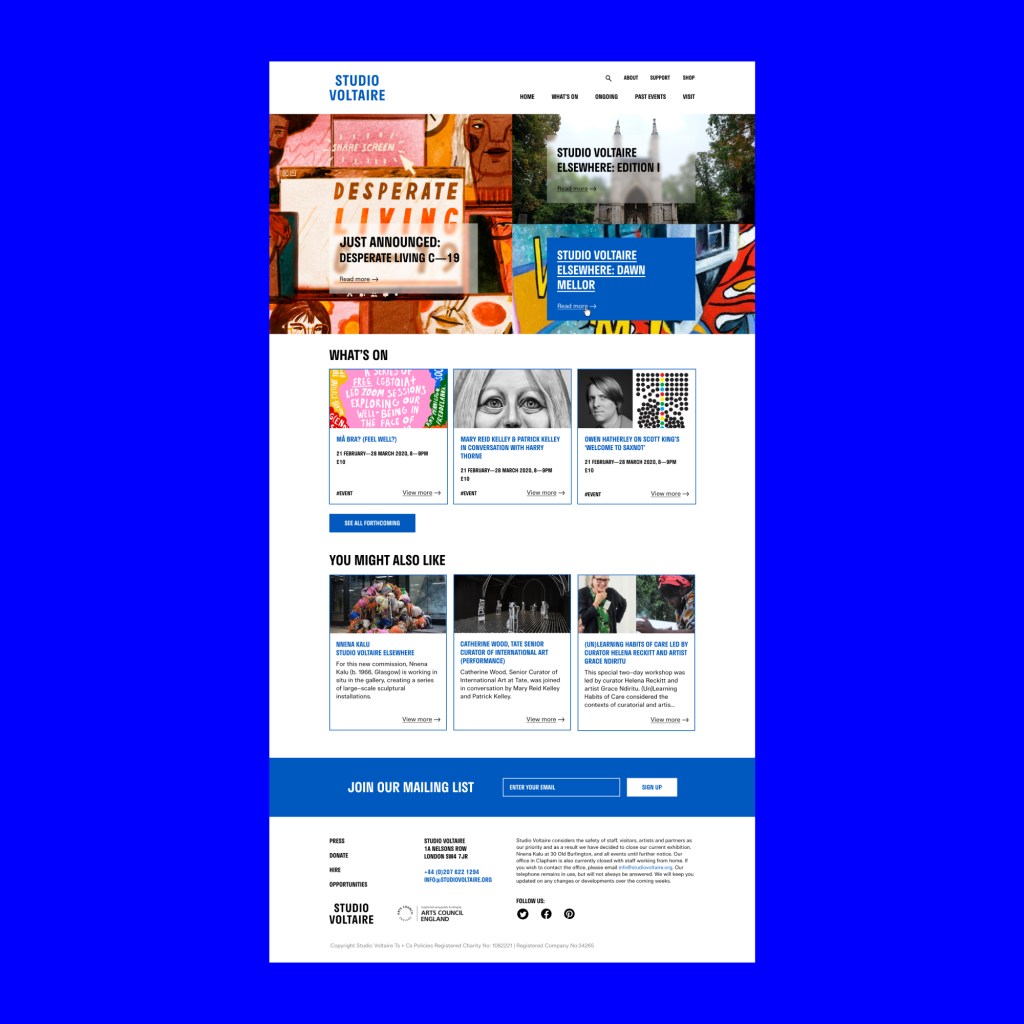
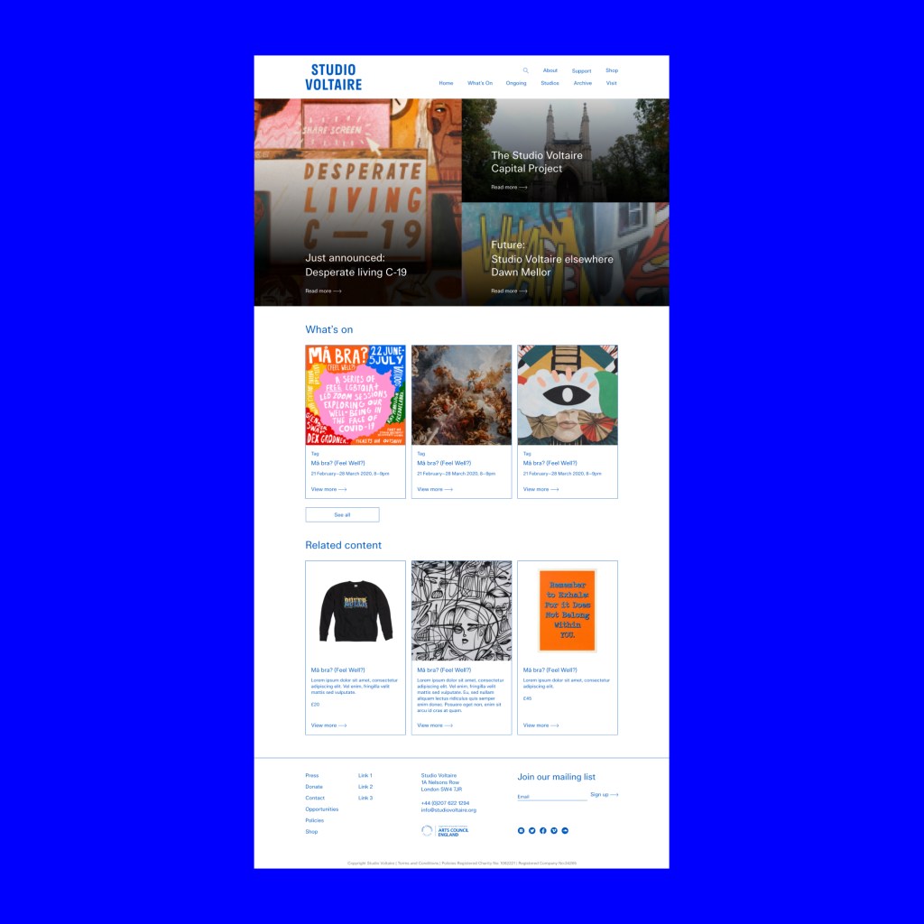
The final design is a clean and minimal layout that makes most use of the high quality images Studio Voltaire has. Adding to the set of pages designed, I also designed a set of components that the client will have the chance to add to their pages and they wish. Giving them the flexibility to tailor their events pages to any type of exhibition.
The evolution of the design. From round 1 to the final round 4.
Reflection
This project was a really interesting experience for a designer like me who really cares about creating accessible digital experiences. Although I am concerned that the website isn’t as accessible and it should be, I am happy that I was able to change some of the clients decisions by showing them what the consequences for the user would be.
Here are some of the talking points that came up during this project:
- The client specifically wanted all pages to not shown a page title, we agreed on only not displaying the title in pages where the navigation showed where the user was which means for smaller screens like mobiles the user will still be able to easily understand where on the website they are.
- The client did not want to show hover states but after I explained the importance of clickable elements looking clickable the client was happy with showing a small underline on anything that is clickable.
- The lack of obvious and clear CTA’s is still a concern, we will keep a close eye on GA to see if it affects bounce rate.
- Making the “venue accessibility” icons more illustrative was a concern of mine. I would have preferred to use the standard icons and these are easily recognisable by people who will be looking for them.
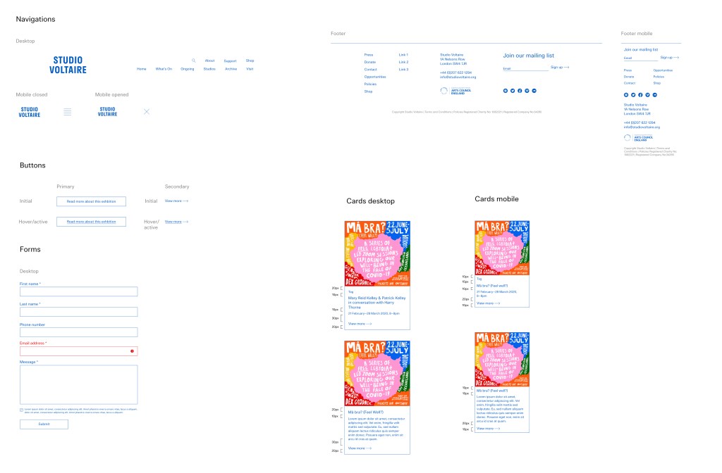
A glimpse at the components used in this project
