SS Great Britain came to us for a re-design and re-think of this micro-site. Mainly used by schools on big white boards, this website needed to be engaging for students and easy to navigate for teachers.
Client:
SS Great Britain
Year
2021

The problem
SS Great Britain approached us for a full redesign of their main website and this micro site that acts as a digital archive: “Collection Stories”.
They needed a website that was more user friendly and that would encourage users to explore both digitally and in-person the ship and the museums.
This covered both the main website and the Collection Stories website. However, the Collection Stories website had the added problem of catering to students and teachers. This would be their main audience, schools would use the Collection Stories website before and after their visit to find out more information on the items they would be seeing in person at the museum.
Constraints
This project started in September 2019 and was unfortunately put on hold due to the Covid-19 pandemic. With members of the SSGB team being put on furlough, our sign off stages were heavily delayed and getting approval became harder and harder.
Unfortunately this project has not gone live yet and we do not know for sure if it will as their needs, due to the pandemic, have now changed.
Challenges
- How do we design an experience that conveys all the information that teachers need but also keeps students engaged.
- Designing for big school white boards


Concept and design
From benchmark to concept
My involvement in this project started very early on. I create all of our benchmark reports as I have a marketing background and I am very comfortable with Google Analytics.
I helped facilitated the initial workshop alongside the UX and Technical Lead where we got the chance to really understand the stakeholders needs and vision for this project, and finally I conceptualised and designed the interface.
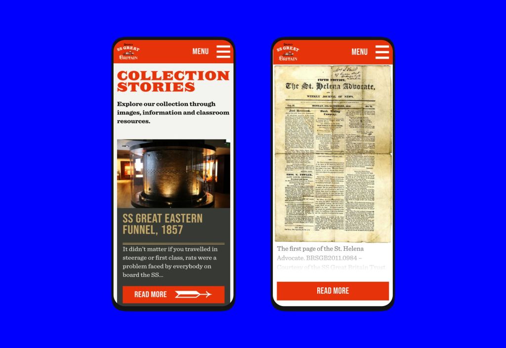
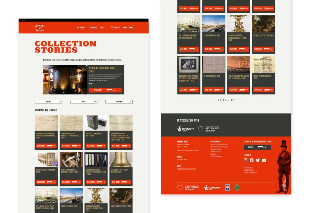
Designing for whiteboards
When it was time to come up with a concept for the Collections Stories websites I had a few things in mind. From the user interviews conducted by the UX Lead, I knew this website was going to be mainly used in big whiteboards in classrooms and that the stakeholders wanted a digital archive that was interactive and different from the main website while still being obvious that it was part of the main SS Great Britain website.
I decided to use the same design system we had been working on the main website to keep it consistent across both projects but to create a completely different layout for the individual archive pages.
I created a split screen design, where on the left all the information would be displayed in a sticky format and on the right the object would be fixed to the VH of the browser.
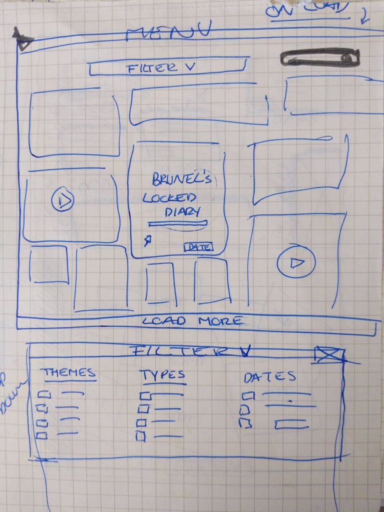


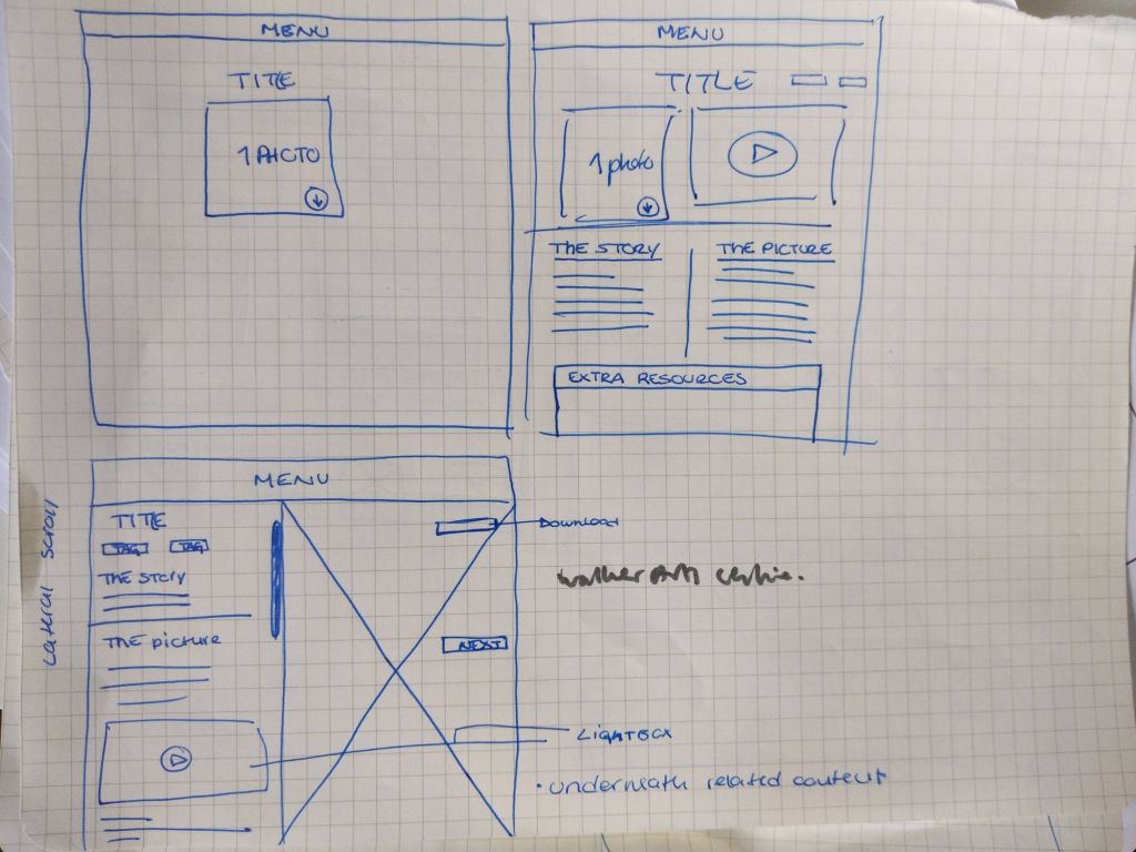
Early sketch layout explorations
Reflection
While this project isn’t live I can’t say yet if it was a success or not, however this project has reenforced the importance of using design systems when designing interfaces especially across different sites under the same brand.
It would have been very easy to create a very similar but different design for the buttons and cards. However working closely with the Design Lead, who was leading the main website design, meant we both knew not to add any new components without checking with each other. Meaning we managed to work completely separate under the same project without creating problems for each other.
